Corporate web design is rather simple, because it often follows basic guidelines and trends. Today, we will go over the complete process of creating a clean and relatively simple corporate web design using Adobe Illustrator.
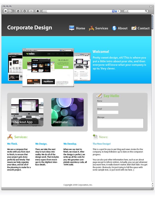
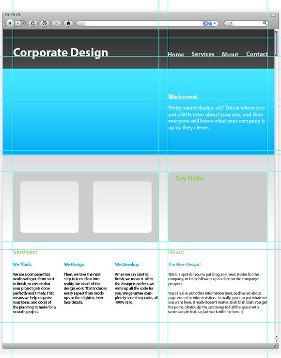
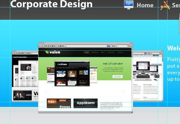
I will talk about the best techniques and approaches to creating a web design started in Illustrator, which is a great tactic. The image below shows what we will be creating. This style of design can be used universally, as it follows many trends, and looks very professional. We will use the most common corporate structure, which consists of a header, an introduction with welcome text and screenshots, and a simple grid-based information layout. After completing the interface in Illustrator, I will go over how to use the Slice Tool to prepare the design for the development stage.
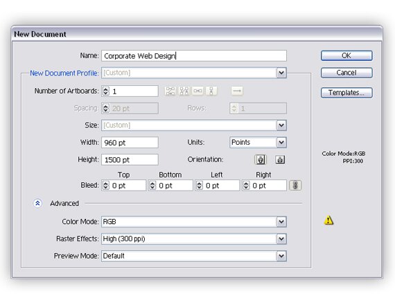
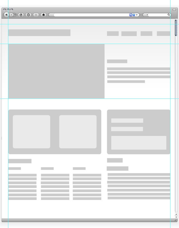
1: New Document
First, we will need to start by creating a new document. Look at the options shown below so you can correctly create the design.
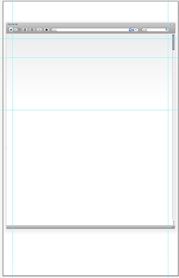
2: Browser Vector Object
After we get the new document created, we will start by making a browser to work within. This will help you to better visualize the design in a browser like environment. This step is actually quite easy, because you can simply download a browser vector set from Vectortuts+. You can find this here.
After you’ve downloaded it, we need to expand it a bit so the design will fit. To do this, select all of the shapes at the bottom, and bring the down. Then, select the scrollbar background and the browser background and extend them down to meet the shapes that you just moved.

3: Base Guides
In web design, you have to build from the ground up. To get the ball rolling, you with the guides. Grids are the foundation to all web design, so that’s where we need to begin. Here, we need to create our base grid, which will then turn into the sections and divisions for the background.
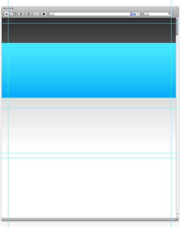
4: Background Fills
After you get the grid all set, it is time to start adding in some color for the background. In the previous step you divided the page into three sections. The top section will be the header. Fill it with a dark gradient. Next, fill the second section with a vibrant color, going from darker at the bottom to more light at the top. This will be the introduction. After, make a gradient for the content background, or the third section. I filled it with a gradient going from light grey to white, or transparent. To add dimension and detail, I also put in one pixel thick lines at the top and bottom of the intro. The line on the top being a very light blue and the one on the bottom a very dark blue.
5: Grids and Interface Component Base
Now we need to construct a content layout. First, hide the layer with the backgrounds, so it will not distract you. Create grey boxes where you will be placing content and interface elements. Then, place more guides to create a full grid system that is appropriate for the location of you interface components.
6: Designing Final Interface Components
The next step is to turn our ugly grey boxes into something real, say interface elements and text? So, turn the backgrounds on. Create a new layer above the one with the boxes, and start turning the boxes into elements or text. Be sure you stay in line with the grid you set up. Start adding colors, and play around a bit until you find a color scheme that you like. To create the rounded corners on the shapes, select the shape and then find Effect > Stylize > Round Corners. I used a radius of 10 pixels. Furthermore, I used Myriad Pro for all of my text.
In the image below, you will notice an interface element in the left column. It has two identical gaps, which will eventually hold thumbnails. To remove the gaps, select all three rounded shapes you made in the last step. Then, open the pathfinder window and click “Minus Front.”
7: Corporate Screenshots
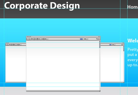
Once you get all of the base interface elements and text, it’s time to go into a little bit more detail. First, we’ll start with the three screenshots in the introduction. Again, we’ll take the vector browser elements that we used early. Move the element into the document, and hold Shift while resizing the browser to keep the dimensions. Place the middle browser, like shown below. Then, make two more smaller browsers and place them next to and behind the middle one. Make sure that the back two browsers are even in size and vertical location.
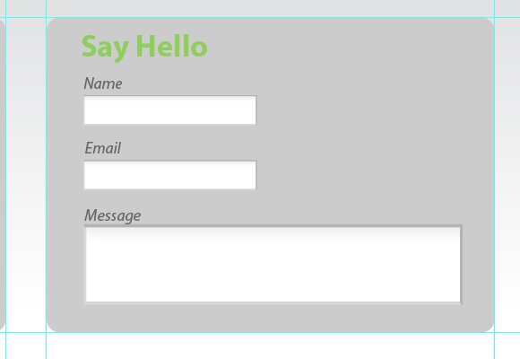
8: Contact Element
Next we will design the contact form. The browser pack also came with elements such as inputs, which you can use instead of plain white boxes. In the box in the right column of your layout, put three inputs, with labels. Use italics and a low contrast for the labels.
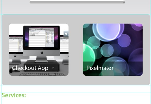
9: Thumbnails
One of the final interface elements is the “portfolio” thumbnails. First, find the element that we created in step 6. Import two small images of about 200 px by 200 px. Place those images behind the element (Right Click > Arrange > Step Backward). Move them to fit behind the grey element so that it acts as a matte to hide the excess of the images.
Of course, there’s always another way to do this. You can also simply import the images and round the corners about 10 pixels. Then, lay it over the grey element.
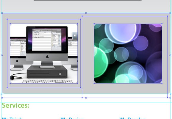
I also added a nice label to the thumbnails. I simply used a black rectangle, with the opacity set to 50%. Then, I used white text as a title.
10: Screenshots
Now we need to insert the screenshots into the browser. The easiest way to do so is to first find the width of your browser. Create a new Photoshop document that size, and paste a screenshot in it. Then, import that into Illustrator; move the screenshot to fit inside the browser seamlessly. You may need to arrange the screenshots by moving them back and forth.
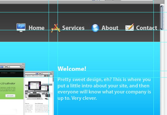
11: Icons
The final set of details is the icons. There are a great deal of icon packs you can find to use that will work beautifully with the design. I simply used a free icon pack, “Jonas Rask Design Icons for Developers.” I placed these icons next to headings and navigation elements, with about a 15 to 20 pixel padding. Below you can see exactly how I worked the icons into the navigation.
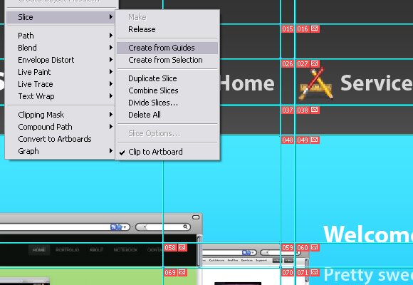
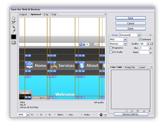
12: Using the Slice Tool
That’s pretty much it, but if you will what to move your design from Illustrator to your development tool you will have to create slices. There are multiple ways to do this. The first is via the guides. You will have to refine your guides slightly to do so. Move your guides so each and every element is in it’s own individual sector. Then, go to Object > Slices > Create from Guides. This will gave you your slices perfectly, just like that. Then, use the Save for Web and Devices tool to save your slices as images to be imported into a web document. You can also select the slices before entering the Save for Web and Devices window, just go with whatever works for you. Remember, to select multiple, hold shift and click the slices. Make sure that when your “Save Optimized As” window opens, you select “Selected Slices” in the final drop down. You can also pick either save as image or HTML document, depending on how you want to move the object to the development stage. With a little bit of coding, you will have a seamless corporate web page, fully styled and functional.
The images below show this process. Here, I was creating separate slices for each button in the navigation. Notice how I only selected the area of the button, and not the padding between buttons.

{ 61 comments… read them below or add one }
Next Comments →
Great tutorial man! Nice & simple, getting into illustrator right now & tutorials like this help a lot.
So i guess nobody has heard about Fireworks then
I always use Illustrator for design. Some things are easyier with photoshop. But still it’s more easy if you have to do multiple layout-versions or subsites.
One thing that I would change are the presets you show above. Why not scale down the dpi to 72 and pixelpreview. And the units to pixel. It’s easyier f.e. to place 1px lines for highlights. The export is more accurate.
@rutiso: psttt, this is illustrator, there are no pixels over here.
Grate tutorial, to bad it hasn’t got more details
i’m with @mko why on earth would you do this in illustrator? What a waste of time! Use Fireworks – that’s what it’s meant for! duh!
Hi folks, this site has provided us with a great information which is very useful , in addition to this i would like you to suggest you to visit a site where you can find various web designing services at a reliable cost.http://www.tec-z.com/
Nice! There are plenty of PSD>HTML tuts out there, but not nearly enough AI>HTML. Thanks.
Well, everybody knows how to do it in Fireworks, I wanted to show something different
Pretty ugly design!
graet tut. thnxx.
Illustrator can be used just as well, as illustrated above.
I like it, can u teach how to convert from ai to xhtml and css?
I have a question about the new document setting, how to we know what size of document we will create, can give a hints or tip?
btw, great tutorial.
Great tutorial pal…The illustrations are so simple that anyone can follow and still the after effects happens to be a more matured approach to the graphics…keep it up
Hello all , here this is a good blog which helped me a lot in gaining a good information.
Well there is! too bad you couldnt see…
I’m designing websites in Illustrator too. But until today I couldn’t figure out how get a pixel-perfect screenshot.
So this is what I do: I start up with similar settings like in your tut, although I use 72 dpi instead. And I use a grid of 1 px and enable snap to grid. When I use “Save to Web”, in some cases i get blurry edges.
I’m using eg. boxes that are exactly pixel-perfect sized and placed. Especially with 1 px inner-outlines, I’m getting a little blur. It’s very obvious when using fonts: While in AI font anti-aliasing looks very good and it comes close to the browser experience, when saving as PNG it gets a little blurry on the edges.
Any solution for that?
Btw: A suggestion for your tutorial: For the document size I recommend 1024×768 or any other resolution you’re optimizing your website for. Then hide the document edges under “view” and resize your browser and content downwards to any size you need.
Because of that, when ever you hit Command-1 your view will be centered at 100% on top of the page. Otherwise it will be centered somewhere in the middle of your content. So you acutally can enter the height of your display’s resolution. But when using eg. 1024×768 you can see what’s within the visible area when design by display the document edges under view.
By hiding these edges, you can add more content to the page beyond the document’s size. It’s not necessary to alter the document settings for output on a printer or as PNG. Because if you’re doing this, AI will add space to the bottom AND top of your document. Which makes you move all of your elements. But actually you don’t need to do this.
Got me? Sorry for my poor english
I find it’s hard to get pixel-perfect export out of AI also. Changing the settings as per rutiso’s comment sounds like it might do the trick, but I haven’t tried it yet.
A sad truth (sad for Adobe, I guess, who don’t seem to change AI behaviour when a user selects 72dpi (obviously for screen purposes not print)) is that I have often just use screen capture tools to capture my perfect pixels out of AI! I’m sure there’s a better way… hacks like me just don’t always have a full skill set.
thank you
Nice tutorial specially the slicing part I didn’t know you can slice the image based on the guides. Good stuff….
Yeah, agreed.
Thanks! Slicing is my new best friend, I don’t know how I lived without it!!
Slicing sounds like a good choice as I’m forever cutting up illustrator docs. I haven’t been able to make it work for me though.
I don’t want to create a table, I just want a bunch of images for my HTML, some of which may or may not overlap. If I create two overlapping slices it just cuts my images up into lots of little parts, no good at all. It also creates a bunch of other images from in between my slices which I just have to throw away. Sometimes it creates a lot of these. I also want to save my images in different formats, some png, some jpeg, some with transparency, some without.
Is there a way I can make slices do all this?
Im always dubious about using or promoting illustrator for web design. I have worked with a few designers who have favoured it and ive always had trouble with the pixel issue, i think thats probably the main reason there are very few illustrator to html tutorials. I use the 960 grid system and i know they provide an illustrator template, might be of use to some people.
raf
Thanks a lot for sharing. Good.
raf sistemleri,raf,paslanmaz raf,celik raf,depo raflari,istif rafları,dosya dolabi,soyunma dolabi I am really fan of your site. Thanks.Good work.
ohh,,good,thank you
Amazing post !
Your tutorial gave me alot of experiences in learning PSD.
Thank alot for sharing, just keep it up.
Great! Ive learned a lot. , thank you for sharing!
Great tutorial pal…The illustrations are so simple that anyone can follow and still the after effects happens to be a more matured approach to the graphics…keep it up
thank you, good
lets go to my site …
rafsistemleri I am really fan of your site. Thanks.Good work.
Great! Love gained a lot. , thank you for sharing!
Wow it is very nice info. It is very nice info. It is very great full I Like it. Thanks a Lot!
Your Information is amazing all website design tips. Thanks a Lot!
… but why use the Ai when Photoshop (or Fireworks) is better for creating websites..? Pixel perfect, hoovers, and… etc. Illustrator is good for vector icones or smart objects, but whole web..?
Thanx
Great Tutorial, thanks!
Illustrator is actually perfect for graphic illustrations on the web. Perhaps it handles files lighter to than Photoshop.
Great Job!
The reason creatives who design for the web use Illustrator is Illustrator allows for more flexibility in the initial stages of design. I have used it exclusively to create design comps. Then I export it to Photoshop and adjust where needed. I provide layered psd file to programmers who then code. The challenge I run into is the font size issue. In Illustrator (on the Mac) the font size reads larger than in Illustrator. For instance, in Illustrator a font size might be 11pt – but in Photoshop at the same overall pixel width and at 96 dpi the font size is 8 They look exactly the same. I can only think that it is from the 72dpi (mac) conversion to 96dpi (what the programmers need). Anyone else experience this?
Dee:
while photoshop might have 96 dpi by default on new images for you, this can be changed in: image > image size. If you change it to 72 dpi, you’ll get the same font sizes as in Illustrator. Just make sure that when changing the dpi in the Photoshop that you keep the pixel size of the image the same.
Very rapidly this web page will be famous
among all blogging viewers, due to it’s fastidious posts
Great tutorial! This is exactly what I was looking for. I was never really familiar about Adobe Illustrator, you’ve taught me a lot with your tutorial, thanks for sharing Matt.
Best post regarding building websites. I appreciated it. This can be big help. Big thanks for sharing!
Nice post. I was checking constantly this weblog and I’m inspired! Extremely helpful information specifically the closing section I care for such information a lot. I was seeking this certain information for a long time. Thanks and good luck.
I’ve been surfing online greater than 3 hours today, yet I never found any attention-grabbing article like yours. It’s beautiful value sufficient for me.
In my view, if all web owners and bloggers made good content material as you probably did, the web might be much more
helpful than ever before.
This article is genuinely a good one it helps new internet users,
who are wishing for blogging.
I blog often and I genuinely thank you for your information.
This great article has really peaked my interest. I will book mark your site and
keep checking for new information about once per week.
I opted in for your Feed as well.
Thank you a lot for sharing this with all of
us you really understand what you are speaking approximately!
Bookmarked. Please also visit my website =). We can have a hyperlink
trade agreement between us
I am sure this post has touched all the internet people,
its really really nice paragraph on building up new website.
Next Comments →
{ 16 trackbacks }