There are so many different ways to represent information, and that is essentially what web design is all about. You see so many different styles and techniques used to convey this information, some better than others. Designing information rich websites is a whole different ball game.
The majority of the population is now using the internet as their main information resource, instead of print. Therefore, it is extremely crucial for news sites to have user-friendly designs. Here are 10 universal tips that will help you design content-heavy websites.
1. Stick to a Grid
Grids are the base of all web design, and they are what all content is built into. It is extremely important to use a strategic and well-laid out grid on information rich websites.
A good grid system can’t just be thrown together. Planning needs to go into it. You shouldn’t dedicate a small column for a large amount of information. Additionally, the proportions of the grid are essential. For columns containing similar information use the same width.
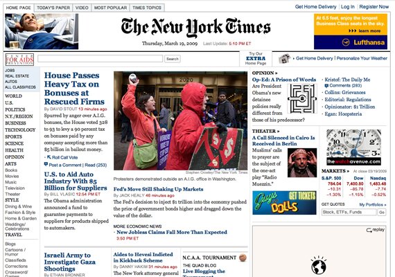
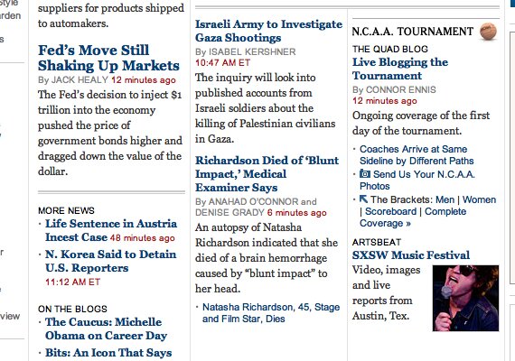
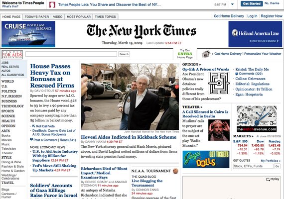
Notice how in the New York Times website, the content is distributed throughout a perfect grid. The eye sweeps through the columns with ease, and everything fits together.
To make the grid, they simply started with three columns. Then, those columns are divided into rows, and smaller columns. Take the middle column for instance. The top section contains featured stories. Below, the main column gets divided into three smaller columns. In conclusion, a grid works when divided with appropriate balance.
2. Use Smart Spacing
Along with the use of the grid comes spacing. Spacing is important in all web design, but it plays an exception role in content heavy design. With the huge amount of text, especially in new websites, it is necessary to work out spacing perfectly so the text does not appear jumbled.
The key with a grid system is the spacing between columns and rows. Look at the image of NYTimes.com once more. Each box in the grid has padding from the lines that divide the grid. There isn’t excessive amounts of space, however. Believe it or not, too much space will hurt the readability. A balance is needed.
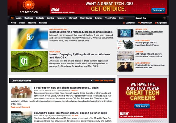
Take a look at this article. There is an ad placed in the article, but there is a large amount of spacing to separate the two elements. This allows the text to flow around, and the advert won’t distract the reader.

3. Consistency is Key
Also, in this style of web design, you have to be completely consistent in all aspects. Everything from typography, styling, and navigation should be the same from the home page through all of the articles. Consistency is a usability characteristic that helps familiarize the eye with the structure. The more used to the structure they are, the better their eye will flow to the important elements in the content.
4. Magazine Layouts Work Nicely
Once again referring back to newspaper websites, magazine design layouts work perfectly with them, and all content heavy websites.
Especially on news websites, magazine layouts are extremely universal. The arrangements of elements in magazine layouts make for a good flow that conveys information in a efficient manor. Therefore, when dealing with large amounts of content, magazine layouts are something to consider.
5. Use Borders and Boxes for Containers
To divide text elements, use borders or contain them in boxes. Both a border and a slightly styled box work nicely.
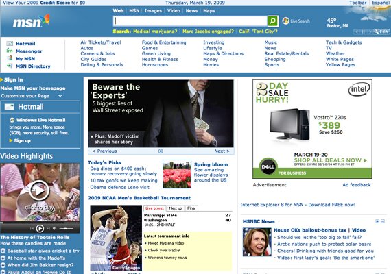
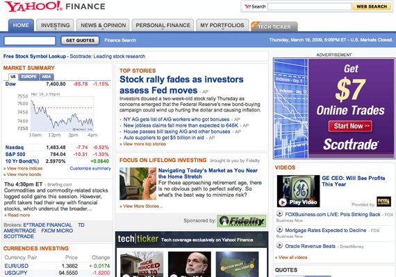
Yahoo! is a website based on a large amount of content. Notice how all of the content is separated, organized containers that are styled as modules with good borders and content styling.
The NY Times website has extreme amounts of content, all packed into a single page. This is organized into a nice grid. To support the structure, thin borders are used between elements.
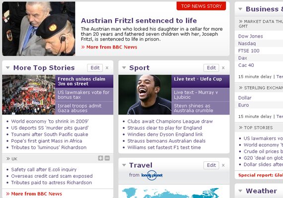
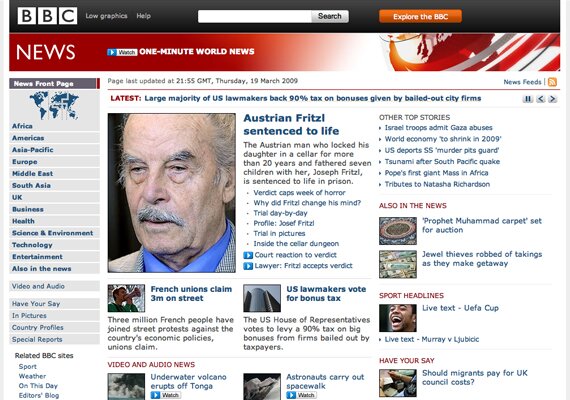
Finally, BBC does a beautiful job styling containers. The wrapper background is gray, but each container has an off-white background and a well-styled header. This looks very nice and is still readable.
6. Legible Typography
With so much content, readable content becomes one of the most important characteristics. You need to use good line height, margins, and letter spacing. Use a line height that is large enough to make content scannable.
Also, some may think to fit more content, they can simply use smaller fonts. This is not the answer, at all. This will simply make text unreadable.
Furthermore, use common fonts. You will notice that all throughout news websites standard fonts are used. Reason? Simply because these are generally the most legible and people are adjusted to them. To take it yet another step, you should have only a few fonts for consistency purposes.
Finally, it is important to use different text colors, and use the same colors for certain text elements. For example, Google News uses blue for titles, gray for the source, blue for related links, and green for further resources. This helps to create focus points and breaks up text.
7. Usable Search Box
Search boxes are an elements that are very frequently used in content heavy websites. To help users accurately find information within the website, a functional search box is key.
Place it at The Top
Don’t make users look for a search box. Give it to them front and center. You should place it very high up, either above the fold or directly below. Either way, make it noticeable.
Large on the Left, Button on the Right: Keep it Simple
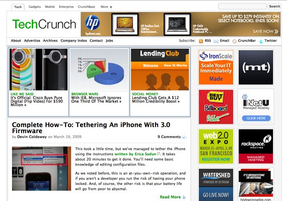
That’s the standard layout, and you should stick to it. A simple and easy to use search box is certainly much more effective. On websites such as the ones shown below, there is absolutely no need to go over board on the search box, and you should keep the styling toned down.
8. A Strong Hierarchy
The more important piece of typography is generally the hierarchy. The structure of the hierarchy is the important key of scannable typography.
Body text is simple, use good fonts and spacing. The headers are the trick here. To show this, we’ll take a look at the Boston Globe home page. First, you will notice the “Page One” header. This is simply a placement label. It isn’t the first thing you see, but it can be found for those who want it. Moving, on you will see the large titles. They are strong, contrasted, and large. When scanning through the content, your eye will naturally move to these. This was done purposefully, because the articles are what you should see first. This is what it means to have a good scannable layout using the hierarchy. If you scan through the page, your eye will go to these titles before anything else, even before the disruptive advertisement.
9. Use an Usable and Clear Navigation
Simple Main Navigation with Sub Navigation
This is the most standard navigation in web design, so it is the way to go on information driven websites.
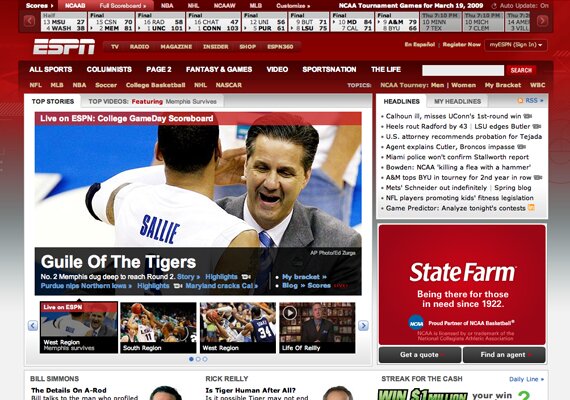
Here is an example of this navigation used perfectly in a content heavy website. There is a great sub navigation too. Notice how the sub navigation is a more dull color than the main navigation.
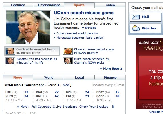
Use Tabs on Containers
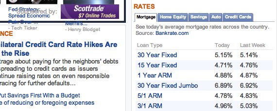
To contain even more content into such a small area, tabbed containers are the way to go. You can fit so much more content in the small area of just one container, and it is still organized.
Drop Down Menus
To clean up the navigation, never mind the content, drop down menus are a helpful tactic that will help to organize sub categories without taking up space like a sub menu.
10. Use Minimal Styling
With such a large amount of content, even the slightest amount of overdone styling can throw off the layout and take away from the content.
Plain White Content Background
It may sound boring, but once all the main content is in there, it will look fine. The background will only hurt the text.
No Image Styling
It is also important to keep images rather simple. You shouldn’t use borders, only use margins to separate images from text.
Use Some Details, No More
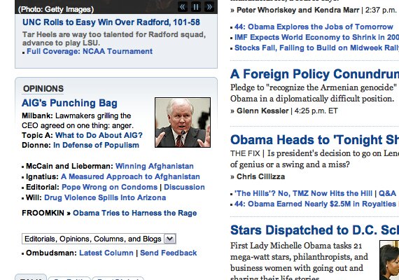
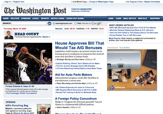
Sometimes, a little styling can be good. The Washington Post site has very small gradients and simple borders. This looks rather clean but isn’t over the top.
Showcase
Here are some very user friendly websites loaded with content.
Google Finance
Technorati
Boston Globe
The Washington Post
What’s User Friendly to You?
Feel free to leave a comment and share your insight!



{ 15 comments… read them below or add one }
I have been designing my own website and I have to agree that using a grid makes the everything in order and organized.
I think the tabbed and slide navigations are the good way for displaying more content than usual.
very useful and comprehensive article! very hard to create such web design..really a big test for every designer.
raf sistem
Thanks for article. It’s good.
excellent sir
Feel free to leave a comment and share your insight!
Gotta agree with a previous comment, using grids does make everything a lot more organized, especially when it comes to news websites… it’s got to have that same functionality has a newspaper… easy for the eye to go through it and read what’s interesting. Thanks for the share.
High quality website design always begins with a detailed assessment of the client’s needs. It is essential that you clearly establish the purpose of the website by determining what information, products or services the web site will aim to provide.
It is perfect time to make some plans for the future and it’s time to be happy. I’ve read this post
and if I could I desire to suggest you few interesting things or advice.
Maybe you can write next articles referring to this article.
I want to read even more things about it!
I read this piece of writing completely about the difference of latest and earlier technologies, it’s remarkable article.
For latest information you have to pay a visit the web
and on the web I found this site as a best site for
most recent updates.
Appreciating the commitment you put into your site and detailed information you offer.
It’s nice to come across a blog every once in a while that isn’t
the same old rehashed information. Great read!
I’ve saved your site and I’m adding your RSS feeds to my Google
account.
I visited many web sites but the audio feature for audio songs current at
this site is in fact excellent.
Hi it’s me, I am also visiting this website daily, this website is genuinely nice and the users are actually sharing pleasant thoughts.
I think this is one of the most important information for me.
And i am glad reading your article. But wanna remark on few general things, The website style is wonderful,
the articles is really excellent : D. Good job, cheers
{ 8 trackbacks }