Design is in the details. No matter what field of design you work with, you will always hear that, because it is very true. The slightest details have a direct effect on the design as a whole. This is true in web design, too. Everything from the amount of white space between two interface elements to the size of a header will impact a website. Another one of those details is hover effects.
In navigation, usability is essential; hover effects not only help styling but they also help usability. Why is that? A good hover effect will tell a user when they have a link under focus, and which link they have under focus.
In the following article, I will go over the best practices and techniques for hover effects. I will be using over 30 examples to show good use of hover effects.
Gradient Hovers
The more common type of hover effect is the gradient. There are many uses of this, here are a few.
Gradient vs. Gradient
Take a look at the navigation shown below to understand what this means. The normal button, not under focused and not selected has a gradient fill that goes from darker at the bottom to lighter at the top. When under focus, the gradient flips from dark at the top and light at the bottom. This is an especially good hover effect because the hover button is very different from the normal, and adds depth to the design. Look at the two buttons side by side. You can very easily determine the difference between the two. This is essential what you should aim for: hover effects that are easily recognizable and distinguishable.
Gradient Button, Solid Color on Focus
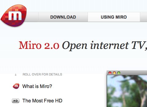
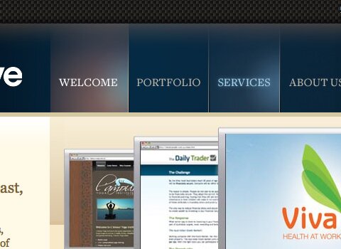
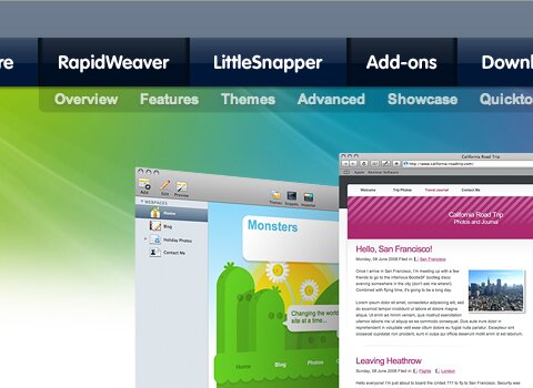
Another common navigation in regards to gradients is the use of a gradient button, and a solid color when under focus. The website below, Miro, uses a gradient fill on each button. When hovering over a button, the fill switches to a solid white.
Two Different Gradients, One Sharper than the Other
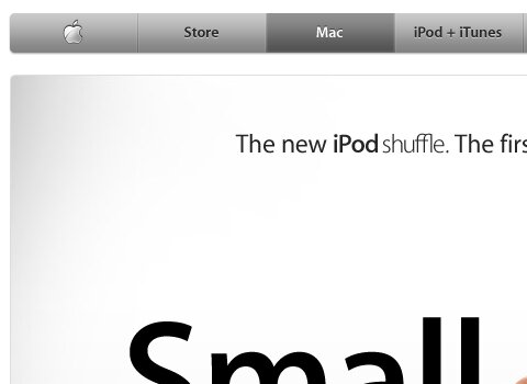
Another effect that I will discuss briefly is the technique of using to different gradients going in the same direction. The standard gradient is light, while the hover gradient is darker. This can be seen especially in Apple.com.
Blur Effect
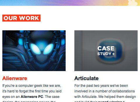
When working with larger interface elements or image links, a blur when hovered over is the way to go. This looks really awesome, and is one of those details that can really help to make the design more usable. Take a look at these websites and how they use blur effects to show focus of images. Notice that in each, the blur is slight so the image is still visible.
In this design, a hover effect is used on each of the portfolio thumbnails. Also notice the labels on each thumbnail. The blur helps to bring the focus off of the image and up to the white text. This is a very usable feature, and it looks very great in terms of styling.
In this site, Best Web Gallery, a blur is used to bring the user’s focus up to the large tooltip preview element.
Contrast is Key
One of the most important aspects of a good hover effect is the coloring, specifically the contrast. The color of text when hovered should be a large contrast from the normal color of the text. Why? Well, a strong contrast improves usability of links and is more convenient to users.
Here is one example of a good text contrast. The orange is a far stretch from white colorwise, so the hover works nicely. Furthermore, the orange actually matches that of the other colors in the site. Staying within the color palette of the entire design is something to keep in mind.
So far I’ve discussed the importance of contrasts of text, but what about button backgrounds? The website below, Bartelme Design, does a good job of contrasting the background color of buttons. The normal button uses a light blue background. When hovered, a dark blue is used. They are both blues that work nicely, but they are far enough from each other that the hover works nicely.
Color Off, Color On
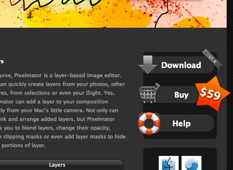
Yet another excellent technique is having an element with no color normally, then show the color upon the hover. Another form of this is navigations’ showing a radial gradient as a lighting effect on the hover. The best example of this is the Pixelmator website, shown below. In a button set in the siderbar, icons are used to support the buttons. When the buttons are not under focus, they are colorless. However, when you hover over the button the color of the icon is shown.
Another technique that goes along with this is that of taking a normal button with a solid color fill and showing a gradient or some sort of highlight on the hover. What does this mean? Well, take a look at the examples below that use this technique.
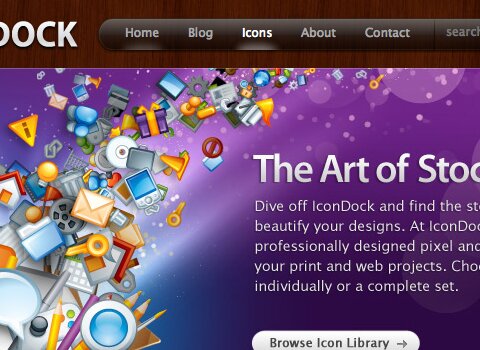
First, we will take a look at Best Web Gallery once again. In this design, the buttons take on the fill of the header. When hovered, the fill changes to a brightly colored gradient with strong highlights. Also, this is an example of the icon without color showing color on the hover. The RSS icon is normally a dark color, but shows as orange when the button is focused.
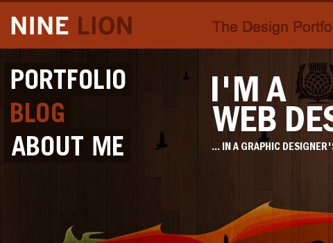
Label Hover Effects
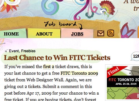
Hover effects can be used for more than just styling and usability. A hover effect can provide more information, similar to a tooltip. You have already seen one example of this, in Best Web Gallery. The screenshot is a hover effect that gives users a preview of the gallery item.
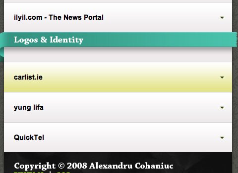
Also, by the creator of Best Web Gallery, Web Designer Wall uses a hover effect with a label. The hover provides more information that otherwise would not fit int the button.
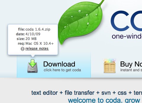
Another well-known hover is the Javascript-based hover element on the Coda website. This one is a label as well as a menu. Hover menus could also be considered a hover effect, but that is a whole different subject.
Also, a hover label is used on Webdesigner Depot. When the user hovers over the title in the header, a label is shown.

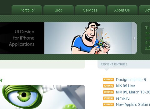
Good Main Navigation Hover Effects
This site uses a great graphical hover based navigation. When focused, the background is expanded as a dimensional element.
A great lighting hover effect.
A nice gradient hover. When the user hovers, a darker gradient is shown.
A nice light hover effect.
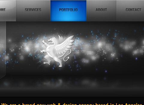
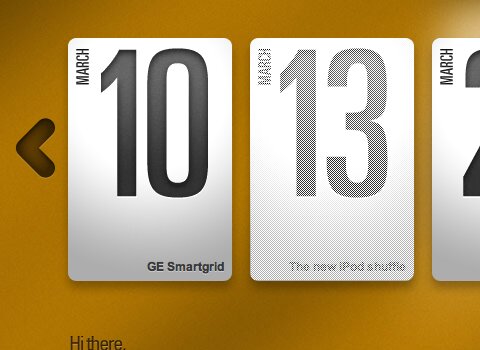
Dragon Interactive
A beautiful and vibrant Java-based hover, with a strong gradient to add dimension.
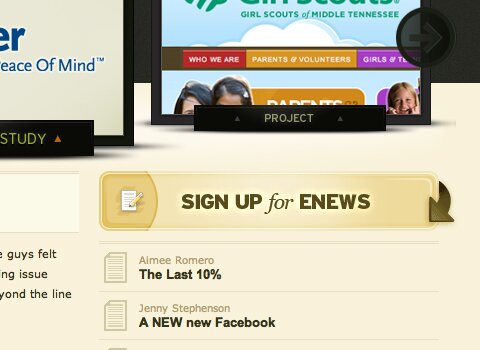
South Creative
A nice lighting hover with nice colors.
RealMac Software
A good example of a strong gradient.
A nicely colored gradient with a good green shade.
Good UI Element Hover Effects
This is a very subtle effect, but you will see that when you hover over one of the two grey interface elements, it darkens.
Another good example of gradient based hover and coloring effects.
Virb
When you hover the interface elements on the right side, they show color.
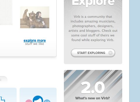
Notice the bright blue hover color on the buttons.

Another perfect example of up and down gradients in structured navigation.
A nice hover effect with a lined pattern.
A nice hover effect that’s awesome yet a bit difficult to really see in a screenshot, show check out the site to look at.
There are numerous hover effects on this page alone, but focus on the light blue hover fill in the product selection element.
Some Not So Good Examples
I don’t like to saw “bad” examples because all of these designs have good features, but I would just like to point out a few places where hover effects should have been used.
Yahoo! should certainly have but a few light hover effects on these tabs and similar UI elements.
Google is meant to be simple, but it’s almost too simple. These are links instead of buttons, so they don’t need too much in terms of hover effects. However, it would be nice to see at least an underline or color hover.
This is an excellent site, but some hover effects such as a color change would help a bit. A light gradient hover could also work.
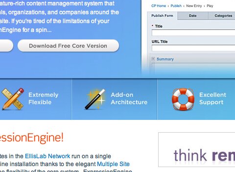
Turbomilk
With tabs, a hover effect should always be used. A gradient color change would work perfectly in this tab set.

{ 47 comments… read them below or add one }
Next Comments →
I am not an expert in web designing. In fact I am a frustrated web designer.
I have always like website with a pastel color combination. I like websites that carry light color combination. For me, a good website should have a hover effect changed once the user have clicked the link already to give them an idea that they already clicked the link.
Yes, that’s true, it’s even better practice to have a selected effect. However, I just wanted to focus on hover effects in this one.
nice article, good examples. we can see here to whom is the sites are addressed and more important how is that achieved.
ps: don;t be a cheeps cake, more written info , grrrrr!
Great Post. Hover effects are small things we miss out in web design from mock ups that don’t describe mouse overs all the time.
As soon as you hover over something you should know its clickable or know that nothing will happen if you click it. Don’t make the user think.
Some really good examples and some great inspiration, thanks.
Nice Post.
One comment about this site, I think the RSS and Twitter buttons would be nice with a rollover
Nice post.
One comment about this site, I think the RSS and Twitter buttons would be nice with a rollover
Sorry about the double post, I got an error the first time “Error establishing connection to database”
“Another well-known hover is the Java-based hover element on the Coda website. This one is a label as well as a menu. Hover menus could also be considered a hover effect, but that is a whole different subject.”
It’s 2009, can we please as a community recognise Java != Javascript
Ha – I was going to say the same thing. There is a HUGE difference between JAVA and Javascript.
Thanks for sharing. This is a great collection of hover effects and there’s a lot of great inspiration here.
As Mepho pointed out, people have to know something is clickable, use the pointer cursor, instant giveaway that something is clickable and doesn’t make the user think. Sounds like it should be there already but you would be surprised at how many designers miss out this minor but important aspect.
nice article
I’m a self taught web designer and I like tips like these. I’m definately going to use this as a reference. Good job and many thanks
Good Collection thanks a lots
Some of them hover do not work with **** IE6.
Hey nice post! I think hover effect is something that many websites don’t have. In fact its been seen that 84% of the websites don’t have any hover, active or focus-effects for sign-up forms. This is quite strange cause by giving an on hover it tells the to the user about the link…or the fact that it is click able.
Check out these sites
1) Designsensory – http://designsensory.com/ (interesting on hover effect, very
simple and neat.)
2) Uhuroo – http://tr.im/uhuroo1066 (simple and clean in terms on navigation)
Look forward to reading more from you in the future. check out my site and let me know what you think, its got other freebies as well as phone tricks, hope you like
Really awesome examples here, thanks for the great teaching post
The turbomilk example is great, altogether another great resource for beginners.
Any effect that makes the website looks good it is good. Don’t over use effects , use an universal effect on all website or 1-2 effects.
raf
They’re nice. Thanks a lot.
With tabs, a hover effect should always be used. A gradient color change would work perfectly in this tab set.
With tabs, a hover effect should always be used. A gradient color change would work perfectly in this tab set.
Look forward to reading more from you in the future. check out my site and let me know what you think, its got other freebies as well as phone tricks, hope you like
Really nice comparison. Hover design is very useful
Thanks for compiling such great examples! I am fascinated by different elements of web and graphic design and loved the visual representation. Keep up the great work!
hello my name is nasir and im new developer and designer for webs …. but i love creative things like these above css styles r so beautiful and amusing … and i will give them a try …. but the best according to me “using the ipad as a creative tool” i have problem with opacity attribute also …… if anyone interested in teaching mediocre developer like me most welcome lol
Very nice post.. Some hover effects are very very good.
Hello
The samples are really good.So can i ask some one to do me a favor ,i am making this website (www.jamiladance.eu),but need suitable hover menu and sub menu. Please please suggest me something.
waiting for help
Thanks
very good examples in your web site .
my all solution soulved in there.
thanks
Nice tips to show how a hover effect must be. Every body can write a code for the hover effect, but it is necessary that it must be user friendly.
hey im curious to ask does anyone know where I can purchase christian louboutin platforms from?
Hello there! This is my 1st comment here so I just wanted to give a quick shout
out and say I truly enjoy reading through your blog posts.
Can you suggest any other blogs/websites/forums that cover the same topics?
Thank you so much!
Generally I do not read post on blogs, but I wish to say
that this write-up very pressured me to try and do it! Your writing style has been amazed me.
Thanks, quite great article.
I am sure this piece of writing has touched all the internet viewers, its really
really nice post on building up new web site.
Hey, I tried this as opposed to using two separate images, but for some reason, both versions (on and off) show when I load my page. Any idea what I am doing wrong?
Thanks
Cheers!
Hey there just wanted to give you a quick heads up
and let you know a few of the pictures aren’t loading correctly. I’m not sure why but I think its a linking issue.
I’ve tried it in two different browsers and both show the same results.
There is certainly a lot to find out about this topic. I love
all of the points you have made.
Hey there! I know this is somewhat off topic but I was
wondering if you knew where I could find a captcha plugin for my comment form?
I’m using the same blog platform as yours and I’m having trouble finding
one? Thanks a lot!
Excellent post. I’m going through some of these issues as well..
Helpful information. Lucky me I discovered your website by chance,
and I’m shocked why this coincidence did not happened earlier! I bookmarked it.
It’s really very complex in this busy life to listen news on Television, therefore I just use world wide web for that purpose, and obtain the latest information.
And responsive web design is the term used for a website which will be arranged differently according to the viewer based on the device the visitor
is using.
After going over a number of the articles on your web site,
I truly like your technique of blogging. I added it to
my bookmark site list and will be checking back in the near future.
Please check out my web site as well and let me know what you think.
I have read a few just right stuff here. Certainly value bookmarking for
revisiting. I surprise how a lot effort you place to create one of these fantastic informative web site.
Make sure that all the first points of contact with prospective employers are proper.
As to your e-mail, do you utilize an expert handle?
If perhaps not, now’s the time to assume a far more
grown-up handle. Stop usernames including misspellings, language and bad
words.
It is good once you are buying job to produce weekly goals.
Create a plan and intent for a particular amount of job-search activities weekly.
This is likely to make it easier that you remain organized and it will
raise your probability of occurring more job interviews.
Whether there are any concerns you’ll usually be asked.
Issues regarding the environment, sort of work to be finished and whatever else you need
to understand should be asked.
Enhance your style every five years to stay current.
Your stylist can help you locate a functional and professional manner for your occupation.
Ciekawa biologia sprawdzian gimnazjum
{ 13 trackbacks }