Today we will look at a quick and easy way to add a sunburst to photographs, using an image editor such as Photoshop. This can be a great way to liven up images, and it can be a lot of fun to play around with. Look at the image below; this shows what will be creating.
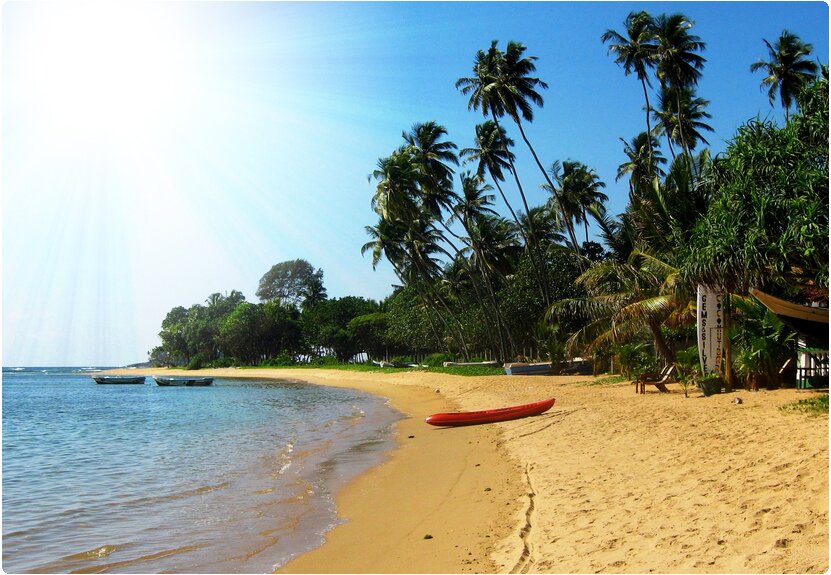
The Original Image
Here is the original image from Flickr.

1: Creating the Gradient
First, we will need to create a gradient. Start by opening the Gradient Editor. Change the gradient type from “Solid” to “Noise.” This will create the lined effect that will eventually by the rays of light. Play around with this until you get a gradient similar to the one below. We will be desaturating the layer soon, so the colors actually don’t matter too much. However, make sure that you keep the color range small and that the two end colors are similar. You can click the Randomize button to easily find a gradient, then play around with the reds, greens, and blues.

Then, like shown above, select the Angle Gradient. Make the gradient extend from the top right of the image and fan out. If you are using a different image, stretch the gradient from the light source of the image.

2: Desaturate and Layer Options
With the gradient layer selected, select Image > Adjustments > Desaturate. This will remove the coloring but keep the contrast and light differences for our rays.

Then, set that layer to “Vivid Light.” Play around with opacity and fill to find an appropriate level for the image you are using. For this image, I kept it at 100%.

3: Light Center Gradient
The final step is adding the light source, which in this case happens to be the sun. In the actual image, the sun is actually off to the left outside of the frame, but by keeping our rays off to the left side we are keeping the lighting relatively consistent.
So, create a white to transparent gradient. Stretch it a fair distance out, originating from the center of or rays.

There you have it! To intensify the light source, you should copy the white to transparent gradient. Not too hard, huh?!


{ 5 comments… read them below or add one }
Never used a gradient like that… with the noise and the angle. That’s great.
p.s. in the first section, you said ‘top right’ when you should have said ‘top left.’
Well, that was very easy. In my honest opinion, the effect could have been produced by anybody who knows even a little Photoshop and did not require any coaching. Thanks anyway.
There are 20 logos in total….Let’s see how good are you with guessing well known logos and don’t leave without telling us how many of these you got right. So, your time starts NOW!!
Nice tutorial. I’ll try it out.
raf
Thanks so much. It’s informative.
{ 1 trackback }