When as brilliant a designer as Peter Mendelsund gets to create a complete new set of covers for the Schocken Books Franz Kafka backlist, the results are extraordinary.
From Mendelsund’s Jacket Mechanical, and via Frank Chimero.
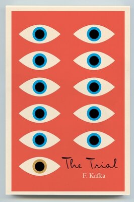
“I find eyes, taken in the singular, create intimacy, and in the plural instill paranoia. This seemed a good combo for Kafka- who is so very adept at the portrayal of the individual, as well as the portrayal of the persecution of the individual.”
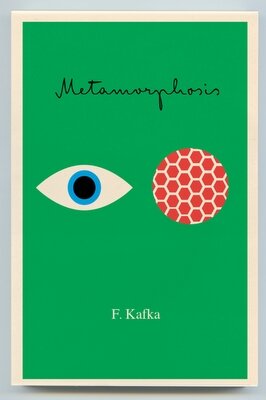
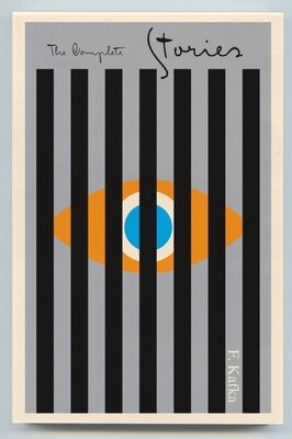
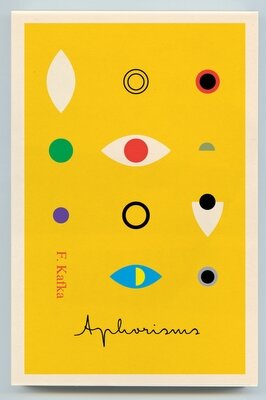
“I also opted for color. It needs saying that Kafka’s books are, among other things, funny, sentimental, and in their own way, yea-saying. ..Kafka was a satirist (ironist, exaggerator) of the bureaucratic, and not an organ of it…[his] books have a tendency to be jacketed in either black, or in some combination of colors I associate with socialist realism, constructivism, or fascism- i.e. black, beige and red. Part of the purpose of this project for me, was to let some of the sunlight back in. In any case, hopefully these colors, though bright, are not without tension.”

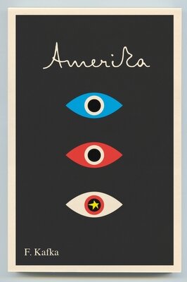
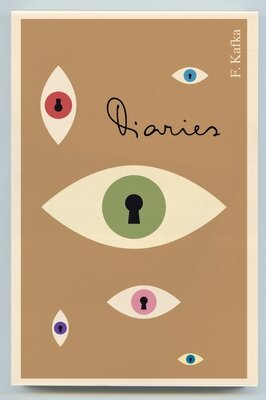
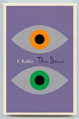
“The typography. The script is an amalgam of Kafka’s own hand, and a wonderfully versatile typeface called “Mister K” (based on Kafka’s own hand) by Julia Sysmäläine who works at Edenspiekermann in Berlin.”
The new issues will begin coming out in June or July.
See other work by Peter Mendelsund (including some covers you will probably recognize) at Jacket Mechanical or the Book Cover Archive.

{ 3 comments… read them below or add one }
Awesome…
Thanks for sharing….
neat stuff! would be great as posters. best, simon at pixmac photography
kartvizit kartvizit örnekleri
{ 5 trackbacks }