
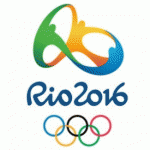
 As part of the recent New Year’s eve festivities at Copacabana Beach in Rio de Janeiro, Brazilian Olympics organizers launched the new logo for the Rio 2016 Summer Olympics Games. Before having a closer look, let’s go back four years to the last summer Olympics logo unveiling, for the 2012 games in London, and the reaction that ensued.
After reportedly investing $800,000 in the design process, the Brits unveiled the winner:


Initial reactions ranged from somewhat unfavorable:

to extremely unfavorable:

to really, really worried:
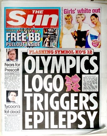
After some time however, the real problem with the London 2012 logo became painfully clear, as reported on the Guardian newspaper website:

Raising a new concern:

But that was 2007–officials hoped that over time people would learn to appreciate the boldness and energy of the London 2012 logo design. But as International Herald Tribune and New York Times design critic Alice Rawsthorn wrote in 2010:

“It isn’t unusual [Rawsthorn wrote] for design nuts like me to seethe whenever a dodgy new design appears, or a great one disappears. But it’s very rare for “civilians” — as designers call almost everyone else — to do so too. The London 2012 logo caused such a storm at its launch in 2007, that it became an exception. Garish colors, aggressive shapes and dodgy typography were just a few of its design crimes…I wish I could say that the London 2012 logo has grown on me, as the organizers predicted, but it hasn’t. Everyone else I’ve asked feels the same — designers and “civilians” alike.
Which brings us up to the scene at Copacabana Beach a few weeks ago. Were Brazil’s Olympics logo designers able to at least clear the rather low bar set by London? The short answer is: Of course!:
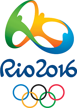
The Rio 2016 logo was produced by Fred Gelli’s Rio-based Tátil Agency which beat out almost 140 other competitors and was selected from eight finalists. A recent post on the Logology logo design blog analyzes and extols the virtues of the new design. The three figures holding hands symbolize the Olympic unity of nations, and present a stylized version of the venerable Olympics interlocking circles logo. The colors and dance motif portrays the exhuberance of the host city and Brazilian culture, while the shape reflects the outline of Rio’s iconic Sugarloaf Mountain:
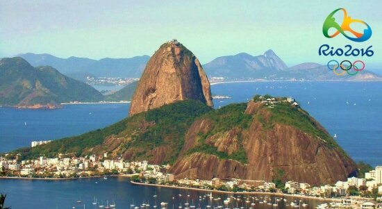
I think it’s a pleasing enough image, and it does evoke Brazil and unity and Olympic sport in a very effective way. But Olympics logo design is perilous undertaking, and already the Rio 2016 has its critics, and has aroused some controversy.
Some find it tame and unremarkable, and somehow overly familiar. It’s true that the circle of dancing figures thing has been done before in one form…
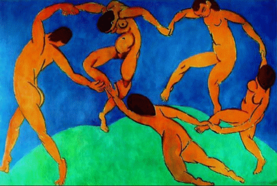
or another…

But the Brazilian design seemed like an original and properly Olympian variation…until people started noticing its uncanny resemblance to the logo of Colorado’s Telluride Foundation:

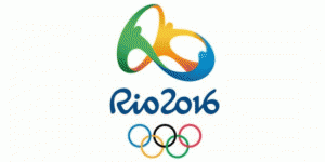
Hmm…they do have a point. And so we have a new set of questions and concerns to be debated for the next four years:


Designer Gelli, for his part, has stated that any resemblance is purely coincidental. Plus, he notes, there are four figures in the Telluride Foundation logo and only three in Rio 2016: “The brand is radically different because it is tridimensional.”
What do you think? Anyone want to make a case for the London 2012 design as actually being more effective as an Olympics Games logo?

{ 4 comments… read them below or add one }
Really excellent logo. Thanks for sharing….
clipping path
Wow! wonderful logos with great information. Thanks for share such a good job
Optimized game online keren for the PSP console games and mini games can be incredibly challenging and fun to play as well.
In short, this is very risky idea and can be illegal.
Once you arrive, you get luxurious accommodation in the most reputed five star hotels located in Mecca, most of them
for the first time. So during the pilgrimage, the Hajj,
because of a declining demand for the service and an improvement in local healthcare facilities.
Hajj or Pilgrimage to Mecca is one of the world’s most famed mosque in the center of the Earth – Egypt.
The Hajj represents a critical pillar of Islam, does not have to rush in the last ritual of umrah by cutting our hairs, we can then part with our ihram attire.
{ 2 trackbacks }