As designers, we all have been influenced in some way by Apple, whether it be their brilliant OS, stunning industrial innovation, or the trends they have started in web/application design. Apple focuses a lot on usability. This can be seen in their products, and Apple.com. It is important for Apple.com to be a usable site, because it leaves a good impression on users, and they will therefore be more likely to buy products from Apple.
A lot can be learned from Apple.com, so I will use the website as a case-study to go over some of the most important usability techniques in web design. Whether or not you like Apple.com is your own opinion, but there are still a number of important usability principles on which it is based.
1. The Most Usable Content Navigation and Menus
Main Menu – The Apple menu is probably one of the more well known and most copied navigations there is. You are likely asking yourself what makes this relatively plain and very simple navigation so great. Well, first is the consistency. The menu stays exactly the same throughout all pages, which is a simple way to avoid confusing the user.
The menu also uses very simple and not overdone hover effects.
JavaScript Mac Menu - The ever so famous Mac menu is one of the easiest and most organized navigations. It is the best way to organize the products without taking too much space. Even more important than the organization is the convenience. It is extremely easy to use, especially because of the clickable labels.
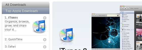
Sidebar Menus - The sidebar navigation is also quite impressive, and usable. The accordion layout allows for many links to be fit into a small area, once again adding to the organization of Apple.com.
Gallery Navigation – Along with organization of content based navigation, organization of images is vital. There are many techniques for making image galleries, some more complex than others. Apple.com features a very simple gallery throughout all groups of images. Some of the image galleries are shown in a lightbox, but all use a common thumbnail menu. It is very simple and clean, but gets the job done perfectly.
Also, note how in each lightbox gallery, all of the images are grouped together in the lightbox. This means the user doesn’t haves to spend all day clicking back and forth.
iPhone Features Menu – Another simple yet powerful menu, the iPhone content is based on a great list style navigation. Like the other menus, it is simple enough that anybody could figure it out.
Bread Crumbs – Bread crumbs show the user where they are within the site. Apple provides bread crumbs at the bottom of each page, which is helpful to users trying to move through the content quickly and without confusion.
Site Map – A site map is one more small feature that goes a long way usability wise. Apple.com has a site map located in the footer, which helps the user find pages even faster.
2. Clean and Flowing Grid-Based Layout
Any website (or any design layout for that matter) starts out as a simple grid. Grids are the foundation to any layout and the content is built upon that grid. Apple uses very clean and well-spaced grids on each page, which makes for a very pleasing experience.
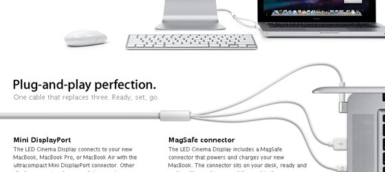
Although Apple uses grids on every page, the grid layouts differ greatly by page. This allows flexibility and originality while staying true to the grid. Note how on the grid below, symmetry is used. The grid sections are all perfectly equally, which is often more visually pleasing to the eye.
3. Consistent and Smooth Colors; High Quality Images
On top of a smooth layout, the colors also compliment the usability of the site. Color schemes are crucial to the feel and vibe of the website. Very often coloring does effect usability of a site, believe it or not.
Contrasts/Color Scheme – Apple used a perfect color scheme, giving a corporate and professional feel. The smooth contrasts help legibility. The color saturation of the site is very neutral, which helps readability. On top of that, links are different colors than standard text, which is very important to usability.
Images- Closely related to coloring, image quality is another important aspect. Apple.com uses many images mixed in with the content. Notice that all of these images are very high quality. Image quality plays a big role in the professionalism of a website. Detail is needed in good images, no matter how subtle. Apple uses a reflection effect on most images to give the image a little more depth.
White Space – The use of nothingness, white space, is one of the more important layout elements of a clean layout. Good use of, well, nothing, can turn a cluttered layout into a clean and visually pleasing one. Margins, line spacing, and letter spacing are all types of white space that Apple.com uses to create readable and overall usable content.
4. Smooth and Scannable Content Organization
Content is the most essential part of any layout, and the way the content is organized certainly affects how users react to the content. Especially on a site like Apple.com, which is packed with a huge amount of content, easy to scan content becomes the most important usability aspect.
Spacing - Spacing and text size go hand in hand with readability. The leading, space between lines, has a huge impact on the readability of text. If too small, the the reader will be squinting, attempting to read the text. If too large, the words will appear to be too separated. Apple.com uses a line-height big enough to make the content readable, but not too spaced out.
Clean Image Layout - Unlike many article driven websites, Apple uses only images with transparent backgrounds. This works with the site because of the color scheme, and because significant space is given between the image and text wrapped around it.
Headers/Text Scannable – The headers and text organization make it easy to scan through content instead of reading. Tests show that most readers will scan an article instead of actually reading through it, so you want content to be easy to scan over.
Highlighting keywords and using different text sizes to show importance is the best way to make text easy to scan. Line height also plays a part in the “scannability” of the text.
5. Fast Load Times
Load time has a massive affect on how a person will move through a website. If a website is exceptionally slow, the user will lose patience and not continue to explorer the website. Slow load times makes navigating through a website with a lot of content very difficult.
Simplicity and good code practice combined create fast load times. There are many other ways to minimize load times, including compressing images, cutting out unnecessary content, and using tools to test load times. That’s a whole separate topic though. Here is a great article from UX Booth called How-To Minimize Load Time for Fast User Experiences, which I would recommend reading.
6. The Search
The power of a search is often underestimated. A strong search with usable features is a necessity of any website. There are many elements that affect the usabilty of a search.
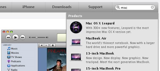
Most websites just use a simple search bar, with no extras. Nothing fancy, just a bar that leads to a search page. Apple.com takes search to the next step. The website uses an javascript powered auto-suggestion drop down menu which shows the top results of a search in progress. Also included is a link to the full search results.
Also pay attention to the location of the search bar. Apple put the search in the upper right of the menu, and it stays there through the whole site.
7. The Subtle Details
Small details are important to any design, even though they may be overlooked by most users. Apple certainly pays attention to the details and it influences the professional feel of the site.
Links – When inserting links into content, it is crucial to highlight them in some way. Apple does just that, and better. All the links, whether it be in the content or in a list, have some sort of distinction.
Separators – In lists, and similar elements, separation between objects is a good idea. In the list below, a simple one pixel line separates the text objects in the layout.
Back to Top Links – The back to top links are a very common usability tactic and are never to be overlooked. Apple.com uses the back to top links occasional in long lists, such as the one below.
Language Selection - There is nothing worse than not being able to market your product to customers of a different region because your website only speaks one language. Apple provides the website in every language, which allows them to expand there marketing range.

8. What Says Usable to You?
There are so many usability techniques used by Apple. Which ones speak to you?


{ 55 comments… read them below or add one }
← Previous Comments
raf sistemleri
Thanks for article. It’s informative.
Excellent web page , I have found this insightful. Loads of helpful tips from it. I’m really interested in the results on unhealthy weight. Maybe you have tried taking lipobind intended for saving fat ingestion? Or, do check it out for. It’s effective to me. I’ve left a url to. Thanks.
Thanks for an excellent article. But do you have any idea what they’ve done to make it so slow to load on IE?
thanks for article. It’s informative.
Great post! I’ve found some helpful tips & instruction from it. Thanks for sharing
← Previous Comments
{ 4 trackbacks }