Hello, and thanks for joining me in my very first photoshop tutorial. I’ll be coming to you weekly with tips and tricks you can use to polish your existing graphic design skills. Our first project involves making a 1950s-style B movie poster, also known as a one sheet. First, we’re going to a movie memorabilia site, in this case movieposters.com, to get a feel for how color, geometric shapes and text were utilized for maximum impact. Remember, we want people to laugh along with us in this spoof, not at us. We won’t look like we know the 50′s if we have multicolored psychedelic fonts, or some dude jamming out to his Ipod at the bus stop in bullet time.
For our walkthrough, we will make a standard romantic potboiler. The fun begins when we round up our jpegs (royalty-free at stock.xchang). Our cinematic opus is entitled “She Wore Heels!”
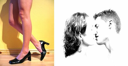
“But wait,” you say. “There are only two jpegs here, and they don’t exactly make the blood boil, let alone a pot.” Yes, that’s true, but remember daddy-o, we’re in the 50′s now. Two people kissing in public and a pair of female legs uncovered well above the knee spells STEAMY! Now that we have our purpose, an idea of our style, and finally our photographs, the pixelpushing begins.
Phase 1: Taking modern images back in time.
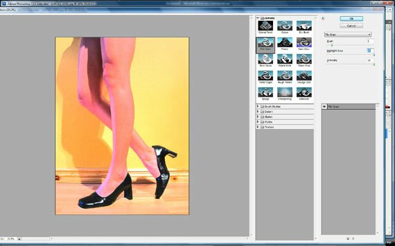
Open the first picture of the lady’s legs and heels in Photoshop and go to Filters/Artistic/Film Grain. Once there, zoom out until you can see the entire picture. We are going to make a color photograph look like someone tinted it by hand in a design studio. For our project its Back to Bataan! No messing around as we play for keeps, ramping up the highlight and intensity sliders for that simplified airbrush effect. Note we keep the grain level very low, as we want to retain the solid black of her shoes.
Next, we’re going to work with the picture of our kissing couple. You recall from our perusal of 50′s era one sheets that additional photographs were often used sparingly, especially for advertising smaller budget films, and these were often production stills in black and white. That is what we’re shooting for with the second picture. After you’ve opened up picture 2, go to Image/Size and, after checking the “constrain proportions” box set the image height to 500. Next, select your rectangular marquee tool, and make a box around the pair, focusing on eliminating the dead white space.
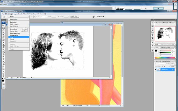
When you’re done you should have a jpeg that looks like this:
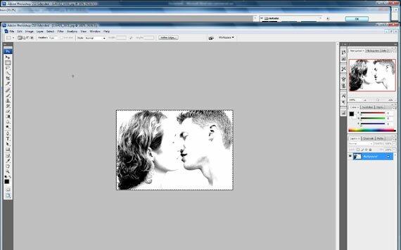
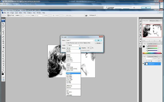
Now the contrast is set very high for this photo, which means we need to find a way to make this look more like a movie still while still maintaining the parameters used in 1950s advertising. One technique often used was to make a black and white picture all one color, usually to match another prominent hue in the main body of the one sheet. Do do so by first going to Layers/New Layer and setting the mode to “Linear Burn” with the layer opacity set to 100%.
For our one-color effect, we need to go back to the first photograph of our mysterious lady’s legs and use the eyedropper tool near the camera-right knee, where there’s some hot pink.
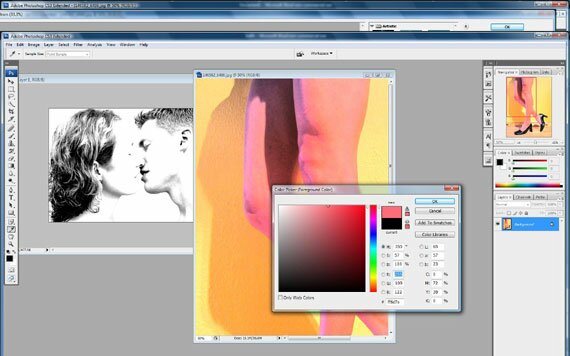
Next select the Brush Tool and select size 300. We’re drenching this picture in pink! Once you cover your jpeg it should look like the one below.
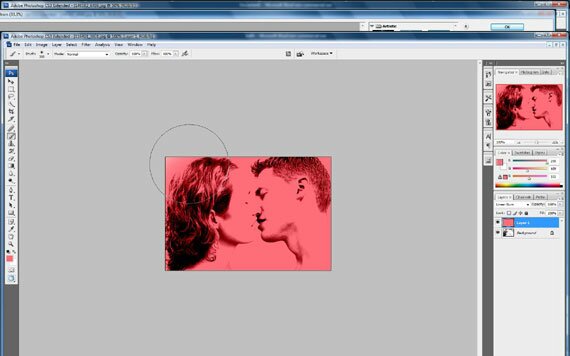
We’re almost ready to place our pink lovebirds in our poster, but first we need to go to Layers/Flatten image and intermingle the pink with the subjects. Then, go back to Filters/Artistic /Film Grain as we did earlier, and make sure it matches the effect in Picture 1. This time we’re going to reel in the highlight area slider to “3″ so our viewers won’t think its some kind of ink blot test, and make the lovers easily recognizable at a glance. The grain slider will remain at 2 to preserve the shadows, and intensity is still rockin’ and rollin’ at a solid “10.”
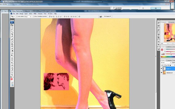
Now , with our Move Tool, we’re going to click and hold the cursor over Picture 2 and drag it onto Picture 1 to make a new layer. Its going in the lower left, and our one sheet-in-progress should look like this: Bare legs! Heels! Kissing in public! Oh no! What’s the world coming to!
Phase 2: Designing text to grab them by the corneas!
The big challenge here isn’t what effects to use with our text, but rather making sure we use the correct fonts for the period with minimal fancy stuff, while answering the challenge of our graphic design forebears in achieving maximum impact with viewers.
First, remember text was often set in blocks. We’re going to draw and paint a black rectangle in the upper right next to our mystery chick’s thigh. Create a new layer set on “normal,” fire up a Lucky Strike nonfilter and go for your Rectangular Marquee tool.
Now, with your brush, still set at 300 and 100% opacity, set your Foreground Color to black and start filling in the selection as shown.
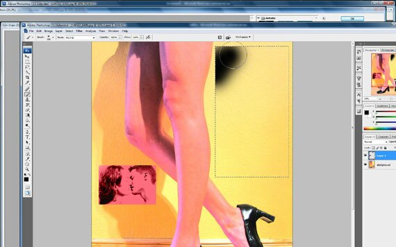
When you’re done, we should have a black box to lure our audience down those soda-and-popcorn-sticky aisles to watch our steamy shocker! Be sure to go back to Filters/Artistic/Film Grain and use that on our black rectangle so it matches the texture of the overall piece.
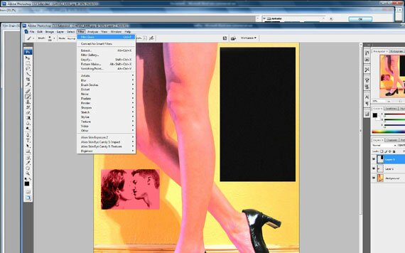
Now click on your text tool. First we’re going to make a little blurb for the top of the box. As with the actual vintage posters we looked at, graphic artists often used cursive but readable letters in conjunction with more basic, strong fonts to achieve their goal. In the font dropdown menu, we will use Forte, set to “smooth.” Once again, we’re sticking with the existing colors already in our poster.
Just as we did when choosing our color to paint picture two, use the color picker in the Text Tool bar at the top of the Photoshop window and, to insure we use the correct shade, use the eyedropper directly on picture 2 itself, which is now Layer 1.
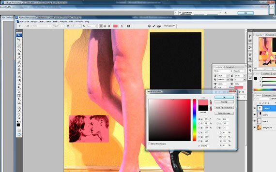
Now that we grabbed our color from Layer 1, we’re ready to make that tagline above the title. Pass me a vanilla Coke and lets get this joint swingin’!
We will set our font size to “24″ with the text aligned left. If it looks like our text doesn’t fit in the black correctly, stay cool. We will use the Free Transform Tool as needed to put those hepcats in awe of us. Our blurb is “We knew she was trouble the moment she moved in because…” Can’t you just feel the tension build? It’ll build a lot better once we get this text fitting inside our box correctly.
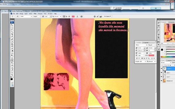
Now we go to Edit/Transform/Free Transform to carefully stretch or contract the letters, adequately filling the black space while insuring the letters are not overly distorted. Below you’ll also find that the phrase was changed to “We knew the widow was trouble the moment she moved in because…” Notice that tweaking the phrase allows us to better fill in the dark background.
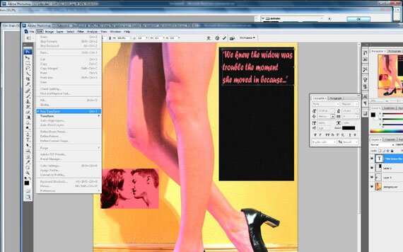
Now we gave our audience a teaser to read. Below that they will need the big payoff. And big payoffs call for strong fonts that can be played with. As we did with the phrase above, we are going back to the Text Tool and this time in the color picker, we will have the Eyedropper Tool pick up some of the yellow behind our leggy siren’s camera-right knee. Then we choose a new font.
I know you may want to fast forward back to the 21st Century, where we can watch couples sleep in a king size bed and pro football players don’t smoke Camels at halftime, but we must live in the moment! We are using Matisse ITC because it fits the era, and is thick enough we can add text effects to it later. With the text alignment set to “center” we type, and then use the Free Transform Tool again to fill up the box.
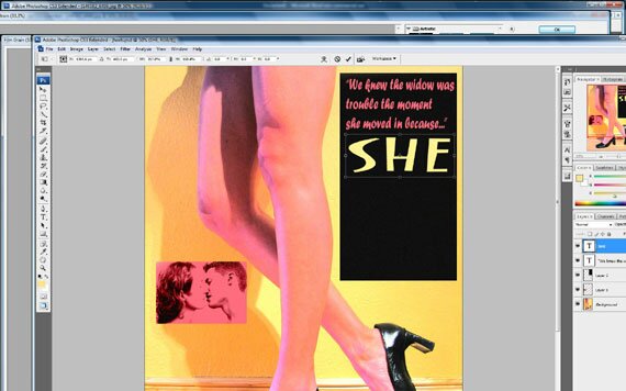
Now we will repeat that step with the words “Wore” and “Heels” in their own individual text layers and use Free Transform on them as with “She” and we’ll be almost done.
Now your one sheet should look like this:
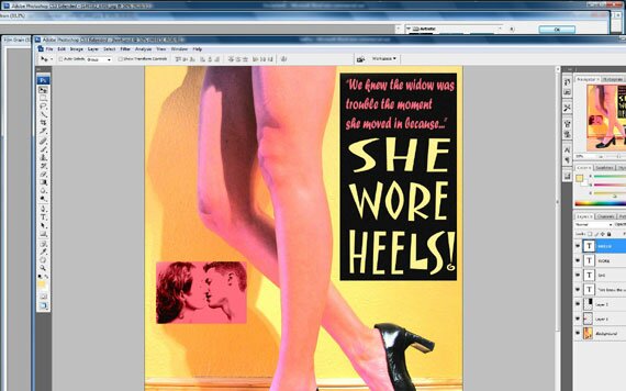
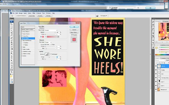
Now to drive the lurid point home, we remind the audience about the cause of all this abhorrent legginess and public kissing. It’s because she wore… let’s say it together now…”HEELS!” We’ll do that by first by highlighting the “HEELS!” as our working layer in the pallette and then cruising over to Layers/Layer Style/Inner Glow. Now let’s dig in and give the neighbors something to talk about.
First, we set the blend mode to normal, and the opacity to 100%. Next, in the “Elements” section we set the technique to “precise,” and, next to “Source” we click on the “Center” radio button. Under Quality we set the Range slider to 40%. Now we should have our title looking like this:
Now all that’s left is to do something with that dead space under the lovers in layer 1. We will use the Rectangular Marquee tool to draw another black rectangle under Layer 1. Don’t forget to reuse the Film Grain filter on the black. Then we’ll add pink text-again in Forte on “Smooth” and we’ll know who’s starring in the film that has everyone talking from the drive-in burger joint to Blueberry Hill. When that is done, our one sheet is done!

Hopefully you all had fun on our journey back to the 1950s, and learned some important lessons that can lend authenticity to your designs when emulating days gone by. First, we demonstrated how important it is to understand how artists used color and shape to achieve their goals in the spirit of the times they lived in. Second, we showed how to implement that knowledge in our picture selection as well as what fonts to use to further enhance authenticity. Finally, and most importantly, we all know the devil is in the details, not heels! These three keys will insure that we can have kitschy fun and keep it real at the same time.
Now, if you’ll all excuse me, I really miss the touchscreen on my phone and I have to order some pizza online. The 50′s sure do make a man hungry.

{ 7 comments… read them below or add one }
Thanks Wes, you did a great job on this! Looking forward to seeing more of your work.
Great tut! Really easy to follow!
This is really impressive work. I hope a lot of people learn from it.
Keep up the good work.
great tutorial.. thanks for sharing
raf
It’s informative article. Thanks so much.
what are the names of the .jpgs used in stockxchange i can not find them there
The step by step tutorial was great and I have learned lot of things. Thanks for sharing. We are the best web design in cambridge bay.
{ 18 trackbacks }